
I got it into my head late last week that we ought to recycle a few of the illustrations we’ve been generating over the last year.
I wasn’t quite sure what I’d do with the stack, so I started with all the usual suspects. I fiddled with mugs, priced out pins whole nine yards.
Somewhere in the midst of an afternoon spent pricing out merch, I noticed I had a text message.
I realized I had been sending a lot more texts using iMessage stickers, and I figured I might as well spend the time fiddling together a sticker pack.
It’s a great process, and while I’ll try and resist the urge to soapbox too hard, but adelyn has a delightful set “From Sketches to the iMessage Store…” that’s a great place to start checking out the medium.
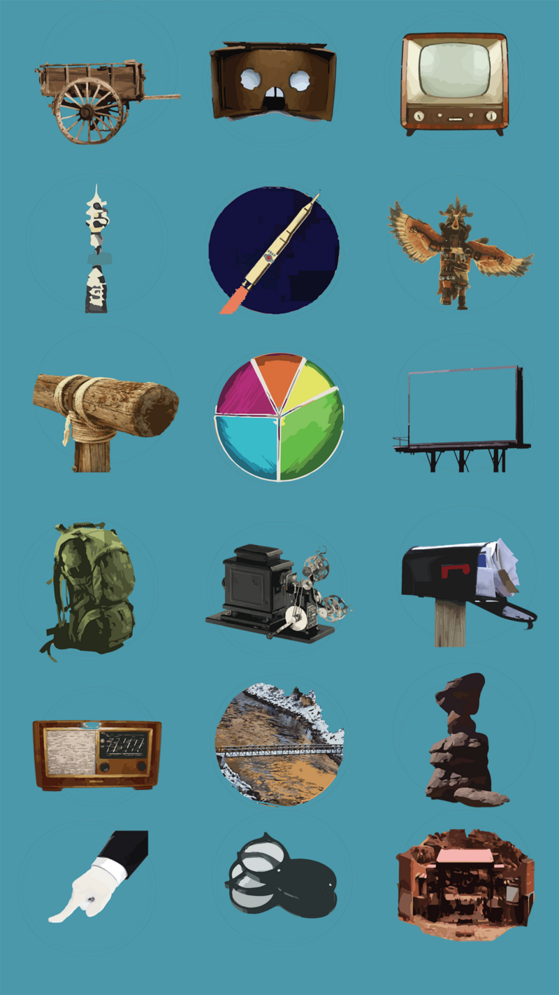
After resizing a few rough images to use as first version placeholders, I started the process of validating and uploading the app.
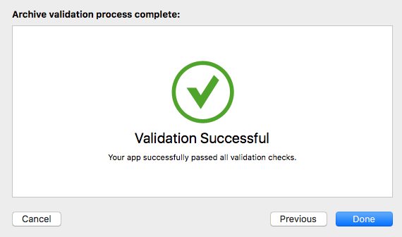
Steps went great. Time to upload.
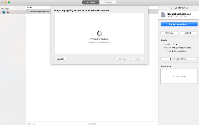
Or to wait…
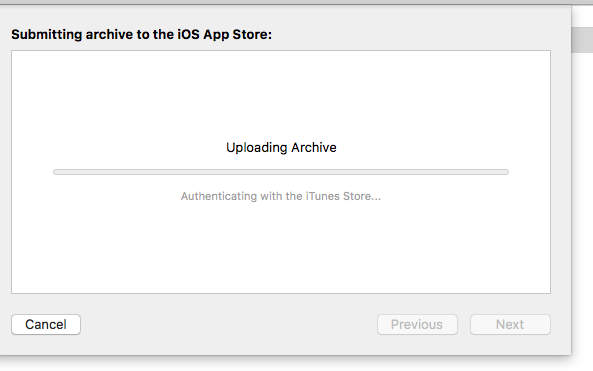
and wait…
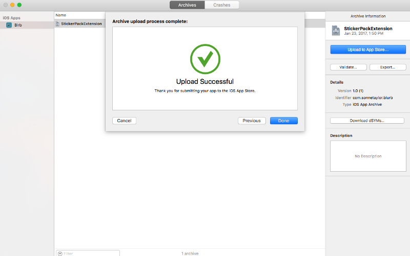
and wait.

We spend a lot of time building out screens for things that aren’t happening in a way that a user might want real updates about. We bury actual settings in consoles and logs and we hope that by doing this we’ll manage complexity in such a way that only the folks who want to be bothered by it are.
But even if something like this screen feels reassuring, it hasn’t done much more than pay lip service to what are otherwise relatively high minded ideals. This loading screen isn’t any more simple than any other, it just looks like it.
That’s not a change, it’s a fresh coat of paint.




Share this post
Twitter
Facebook
Reddit
LinkedIn
StumbleUpon
Pinterest
Email